
I have dreamed, for at least a decade now, of having a space that in every way reflects who I am. A space of my own, where I can write, pray, cook, dream, and rest. The more time passes, the more I embrace my homebody nature. I love to create a home, in the fullest sense of the word—a place that is beautiful, uplifting, artistic, and serene. A space that reflects my values and reminds me of who I might become. A sanctuary.
When I have envisioned my ideal space, I have always wanted it to have a kind of intellectual, highbrow quality. I don’t mean that in terms of lavishness or expense—I mean ‘intellectual’ as it relates to the design and the mood it inspires. I imagined a space filled with the art, colors, flowers, and books that light up my mind. In this space, I could write and concentrate deeply, working on my blog, my business, projects, and any other writing I felt led to pursue. Ideally, this space would have an aesthetic that invigorated and inspired my days. It would feel eclectic but polished, sophisticated but livable, smart and fashion-forward.
Like the rest of my family, I am a clean freak who likes things well-ordered and styled at all times if possible. I’ve never been a good cook, although I am intellectually interested in the art of cooking and ingredient sourcing and the sensory beauty of it all. In my dream space, I would cook well and drift seamlessly from garden to kitchen and back again, with flowers or herbs for the day’s meal. I guess I connect my dream space in some ways with my dream self—the person I might become. I am hardly the first to believe that architecture has the power to inspire such efforts. In The Architecture of Happiness, Alain de Botton observes that “we are, for better or worse, different people in different places… and it is architecture’s task to render vivid to us who might ideally be.” I could never argue the aspirational potential of our buildings and especially of our intimate living spaces.
de Botton echoes the great John Ruskin when he suggests that we seek two things from our spaces: “We want them to shelter us. And we want them to speak to us—to speak to us of whatever we find important and need to be reminded of.” While I disagree with de Botton’s philosophy on a number of the most important issues (faith, love, being), his insights into architecture dazzle and deeply resonate with me. A home should ideally be a place of shelter from a cruel and hostile world, a place where we are freed to express our own taste and values. It isn’t just about having a merely beautiful space, but one wherein we can be reminded of our values and beliefs—where we can silence and refresh ourselves before going back out into to the world. For me, that means a space where I can deeply dwell in God’s Presence and listen to His voice.
When I create anything, my prayer is always to put back into the world some goodness, purity, or beauty—some reflection, however dim, of Christ’s love. And in ways I can’t fully articulate, this is what the creation of a home is all about, for me. Every day, I see evidence of our prevailing culture’s deterioration—moral, intellectual, and aesthetic—and every day, I want to fight against this degeneracy. I want to preserve what is True and Beautiful, in the most eternal and unassailable senses of those words. While I know these are qualities I can only carry in my heart, I would try and stamp love, joy, peace, patience, gentleness, and self-control on my very walls if I could. I am only interested in creating things that feel pure and peaceable, and I realize I can only ever do this by abiding deeply in Christ.
When it came to designing this space, I settled on a word or mood to return to. I am hugely against ‘themes’ when I design events or spaces, but like any good choreographer or composer would, I like recurring patterns, rhythms, refrains. The words botanical bohemian seemed best to capture the mood I wanted to evoke. The space would feel artistic and unorthodox, free-spirited and multi-layered. But I didn’t want it bohemian in the sense of macramé and cacti (although there’s nothing wrong with those things)—I was after something a little moodier. Of course, the space needed to be rich with floral and botanical patterns, arrangements, and references. The end result felt sophisticated and intellectual, and I was so pleased with the way everything came together. It feels like a little jewel box of a space.
Before I begin to describe the design process, I would be remiss if I did not write that my mom is a creative genius. The interiors she designs are so much more than beautiful—they have that intangible something, that indefinable ‘x factor.’ Some might call it love. I certainly would. I am deeply blessed to have grown up in beautiful homes. Home, to me, was always a place that nurtured my creativity and love for design, and more importantly, it was a place of grace, safety, rest, and peace. My mom is completely to thank for this. And my dad, who has designed homes and pools for over 30 years, is of course knowledgeable and mechanical beyond what I can comprehend. So, while I may have taken a more active role in designing this space, I was helped all along the way by my parents and was, as always, the beneficiary of their wisdom and gifts. When I describe the design process and the details I love, please don’t read into it as boasting. Please read instead my gratitude for my family’s talent, and my own eagerness to explore the process of creating home spaces.
It’s also hard to take credit for anything, because, as with all intimate relationships, it can be hard to tell where one person’s ideas end and the other begins. So while the post suggests that this is a reflection of my heart and aesthetic, it’s really a confluence of my family’s efforts and designs. I’m truly grateful for the development of the space, which had everything to do with their guidance.
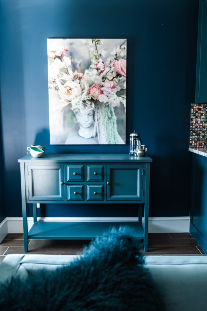
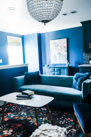
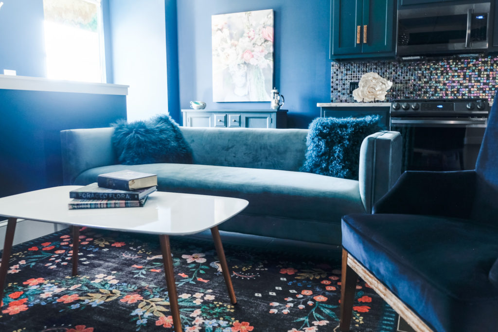
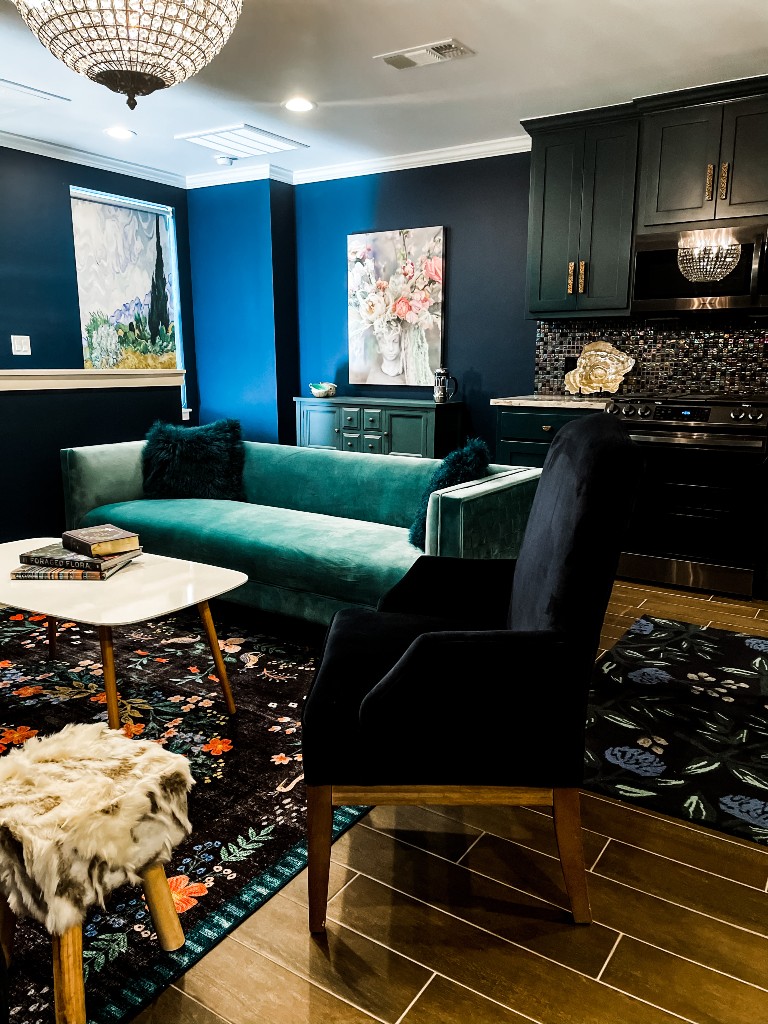
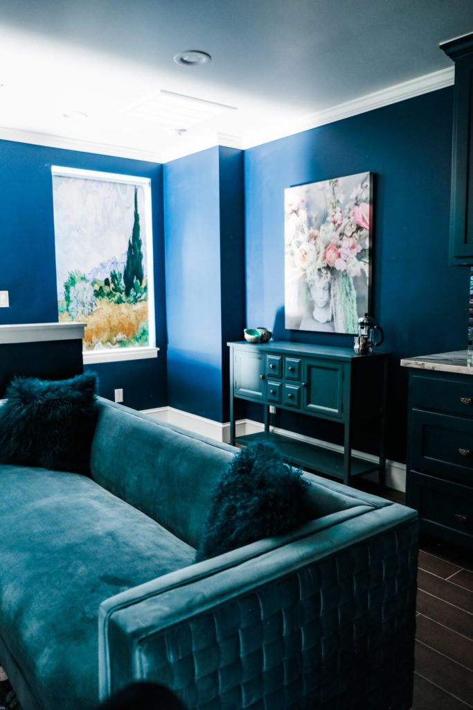
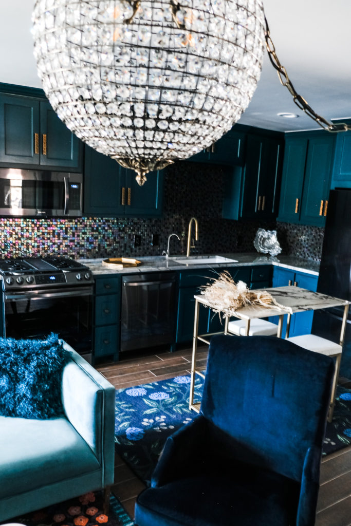
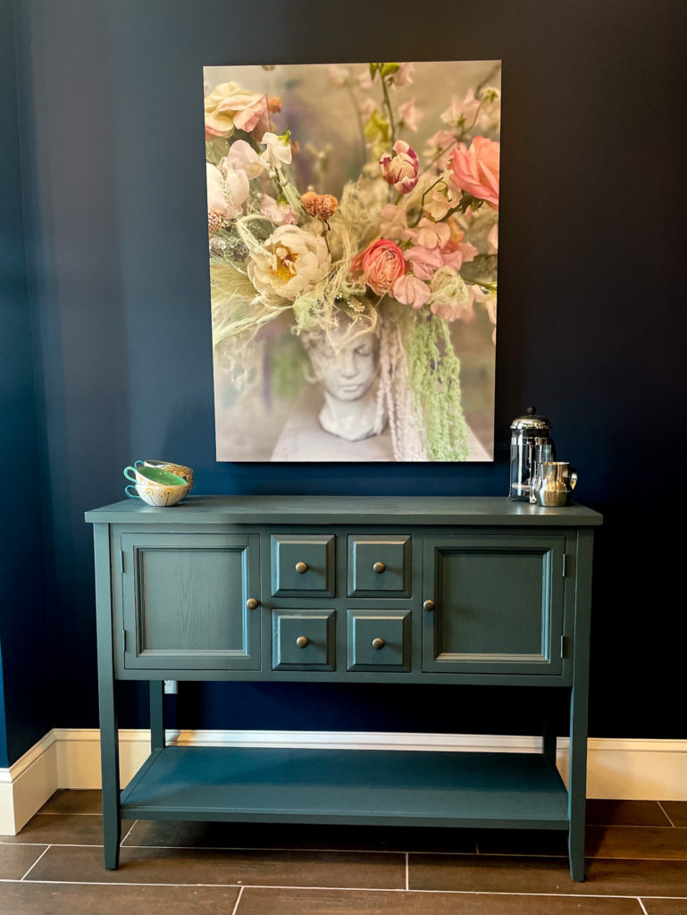
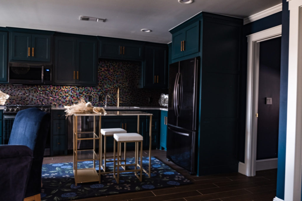
For the cabinetry and living room walls, I chose perhaps my all-time favorite color, Dark Harbor by Benjamin Moore. I was obsessed with teal before the rest of the world was (I promise!), hence the Van Buren House palette. I remember first falling deeply for this color while watching the Victoria series, especially the opening credits, where Victoria is pictured against assorted teal backgrounds. The color felt regal, deep, artistic, intellectual: I was in love. As it happens, when it comes to interiors (and pretty much anything that can be painted), I am not afraid of color. I am, in fact, slightly unmoored over a lack of it. At any rate, the teal color set the overall mood and instantly gave the space a level of refinement and sophistication. It’s incredible what color can do, how deeply it can communicate mood and values.
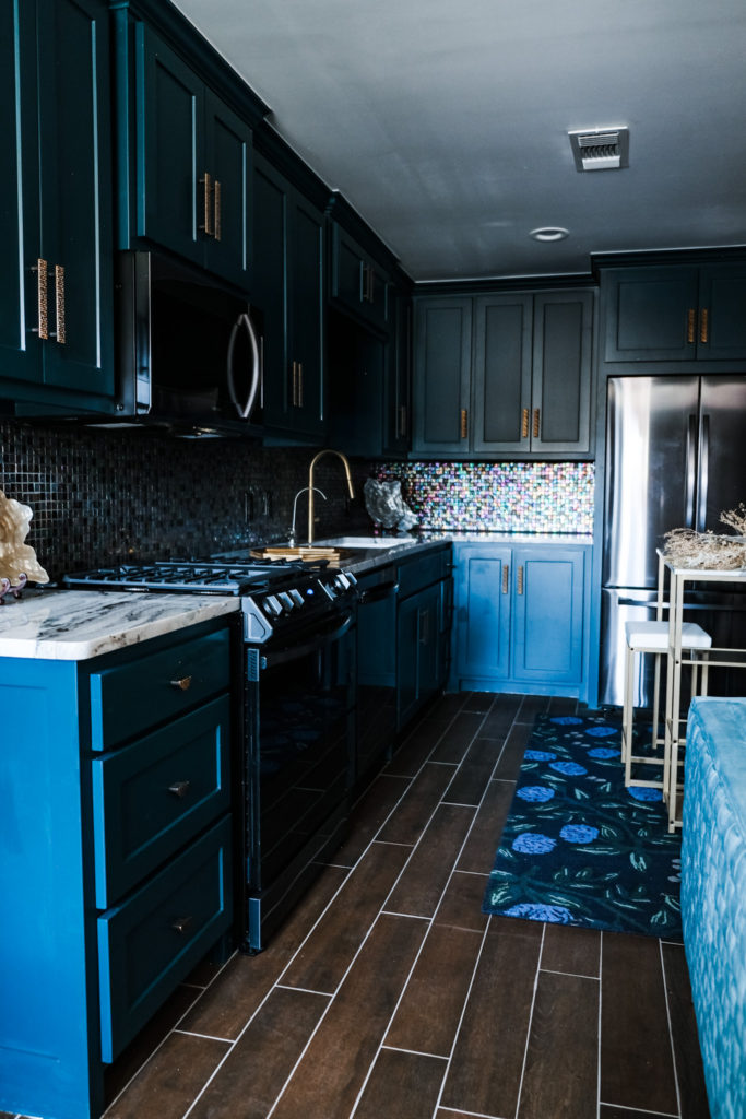
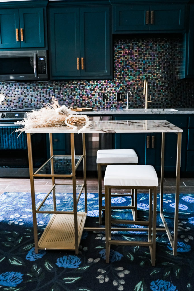
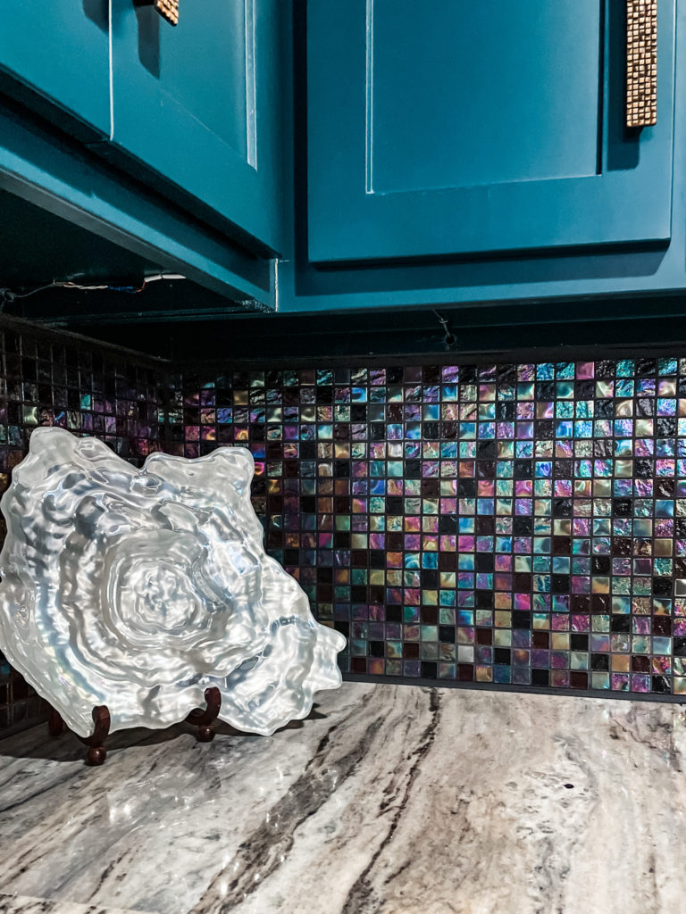
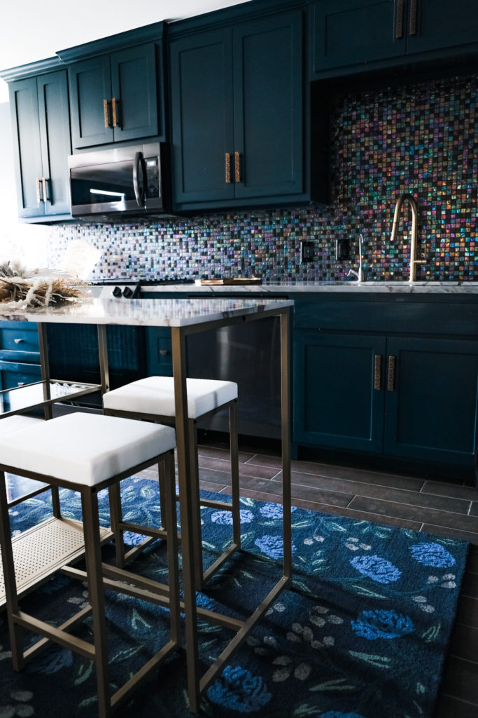
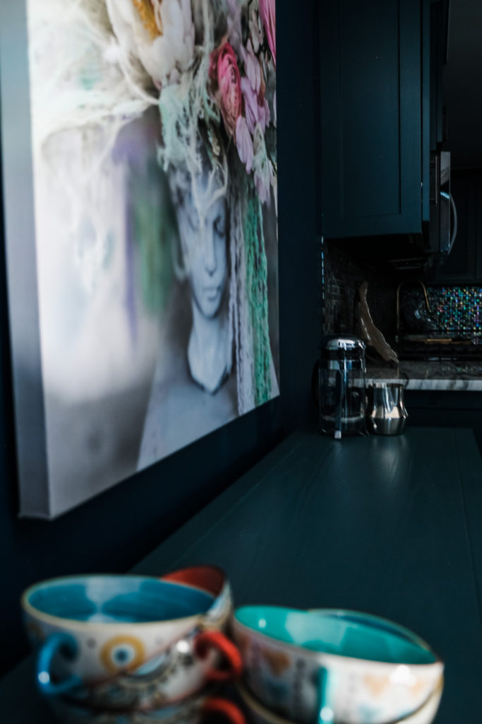
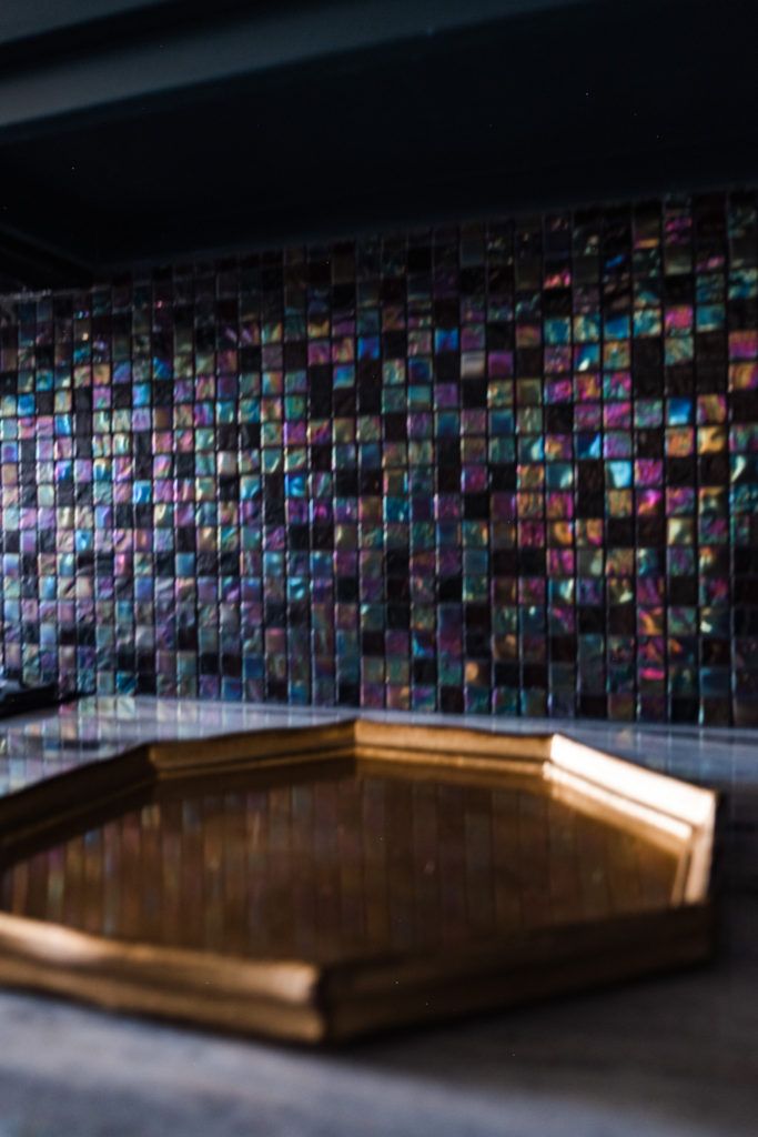
One of the first pieces I chose was the kitchen tile. Unbeknownst to me, this choice would play a pivotal role in connecting all the other hues in the color palette. Shimmering and iridescent, the pattern includes teals, mixed metals, aqua, lavender, and opalescent hues. I knew I wanted lots of pearlescence and shimmer, so this tile worked perfectly. It’s actually a swimming pool tile (thanks, Dad), hence the tiny shape! The small size of the space allowed me to lavish detail and make risky choices like this tile, which would be overwhelming in larger quantities. I love the jewel box size of the space, which encouraged a certain adventurous aesthetic. Certainly, many of the choices I made here wouldn’t work in a large home; the small size actually freed me to use complex patterns, colors, and elements of décor.
The kitchen is the perfect size for one. I don’t have room for an island and a table, so this counter-height table provided an elegant solution. It’s perfect for both preparing meals and enjoying them, and as an added benefit, it’s really pretty, with its marbled top and brass legs. I have not been able to cook yet here, but for one of my first recipes, I imagine I’ll make a cauliflower salad with spicy roasted chickpeas, parsley, radicchio, chervil. I may even be ambitious and make my own pita bread. What do you say, blog post about this?
And of course, if this is to be a bohemian space, it needs a Marrakech-style light fixture. This brass chandelier felt just right, more exotic than purely pretty.
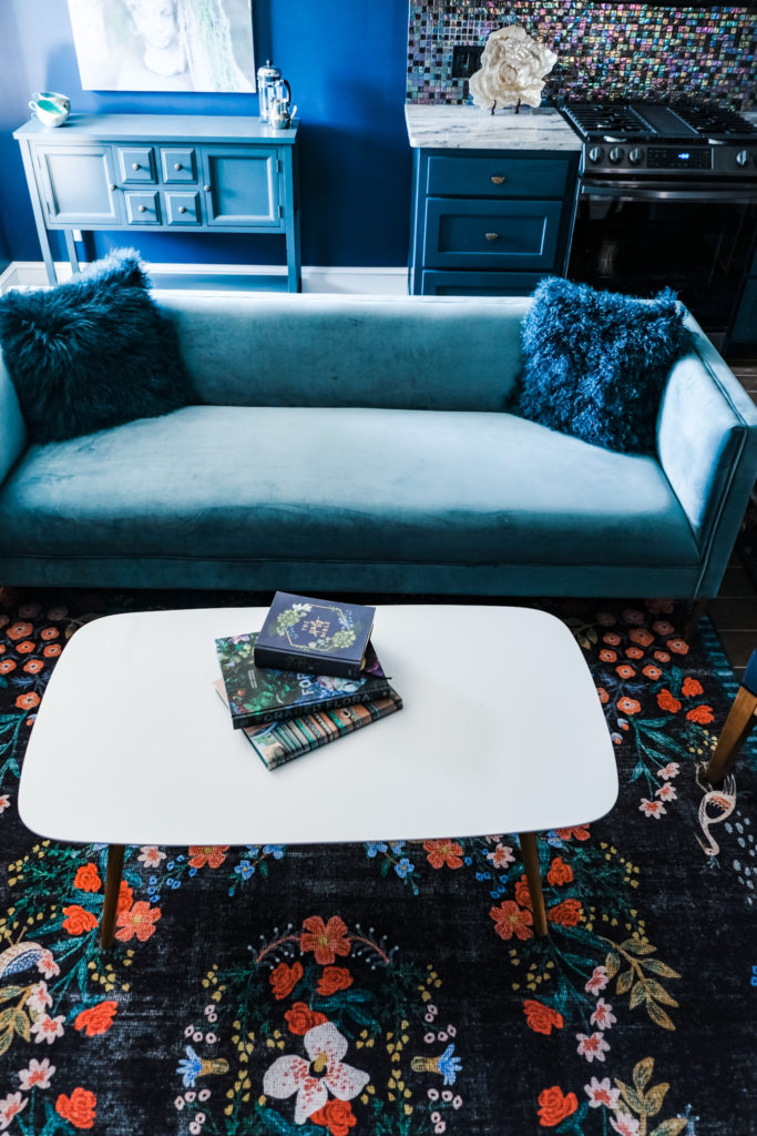
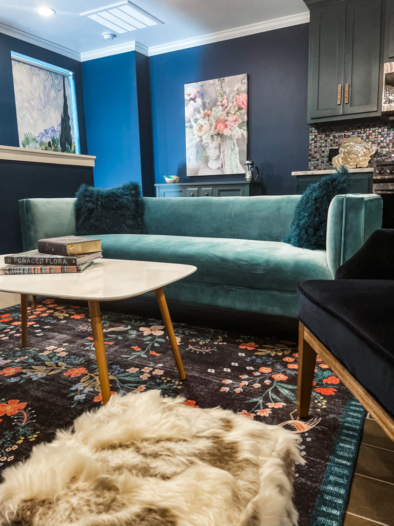
The living room is the botanical bohemian lair of my dreams. There are so many rich teals, deep emerald, blush, and even persimmon hues. These colors remind me of all of my favorite bohemian things—of embroidered dresses, and of exotic markets with glistening fruits; of tapestries, lavish gardens, and bejeweled pomegranates. The teal velvet sofa feels just right for a boutique space like this, and I particularly like its woven back. Fur elements added a layer of texture, and midnight blue/black chairs added depth.
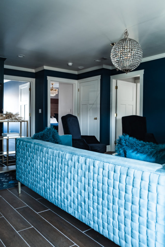
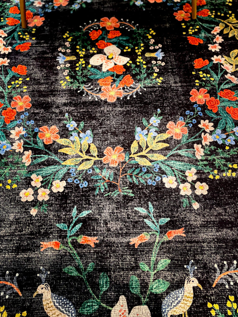
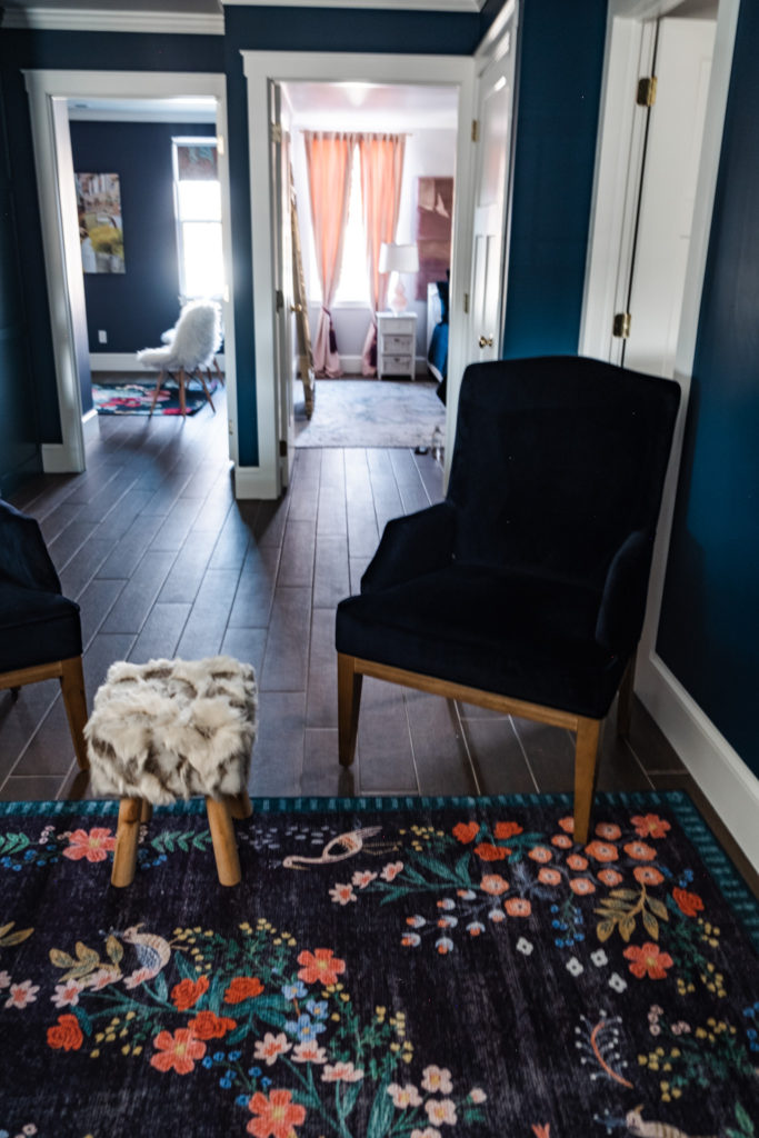
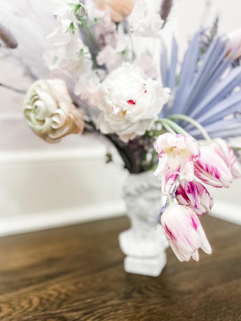
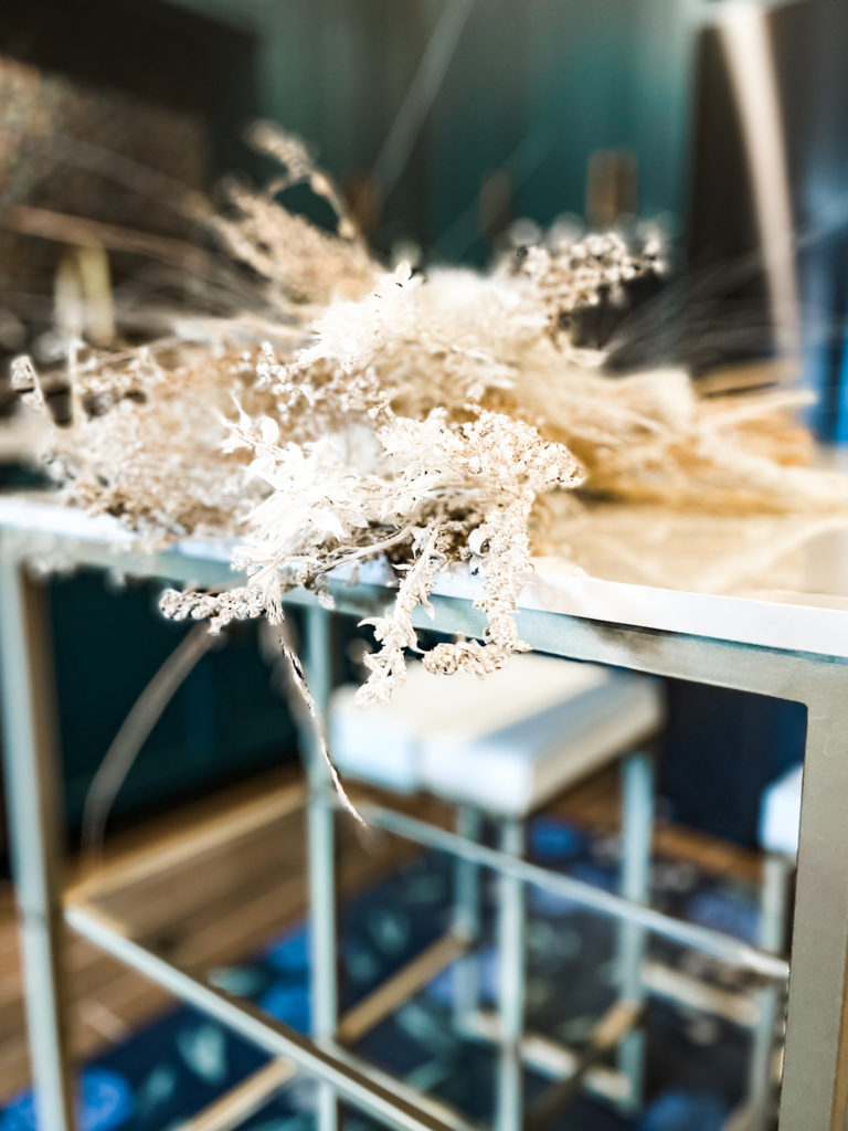
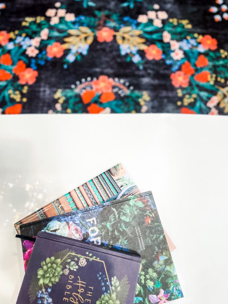
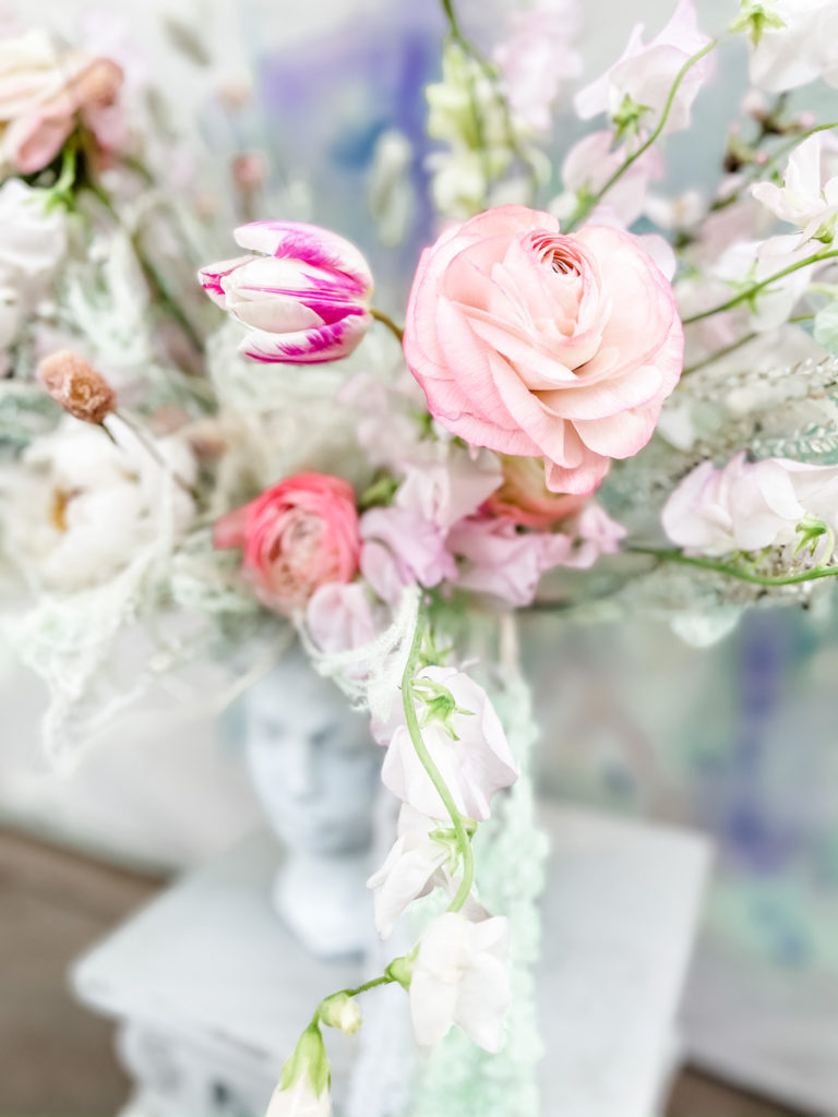
Throughout the home, I have interesting flower arrangements, dyed pampas plumes, and canvases with some of my most beloved arrangements. Dried florals play a huge role in my work and life, and I love the collection of drieds here—all fashion-forward flowers in pastel shades of lavender, mint, and white. The rugs are beautifully suited to a botanical lover, and all are designed by Rifle Paper Co. The living room rug in particular reminds me of my favorite house of all time—a Swiss- style cottage whose exterior was hand-painted with flowers—flowers on the shutters and around the window-frames, complemented by seasonal flowers spilling from wooden window-boxes. That house was my childhood dream, the only home I ever fell in love with at first sight. Anyway. The pattern of this rug is so similar to the flowers on that home, it fills me with such sweet nostalgia.
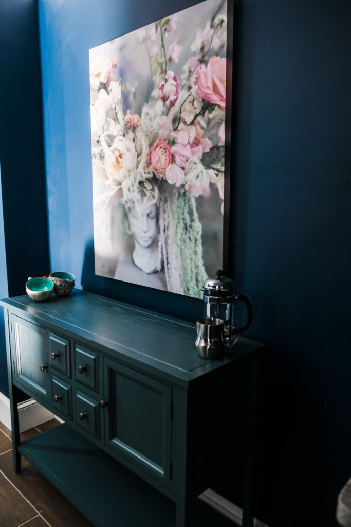
Coffee is hugely important to me. It is just like the ambrosial nectar of life! Of all the things that make up my day-to-day—of any food or drink—coffee is the one thing I love wholeheartedly and wouldn’t change anything about. That being said, I had to have a little coffee bar. It’s petite but perfect for one person, and painted in a pretty shade of teal. I’ve styled it with a French Press, an espresso machine, and my favorite pretty mugs (because the cup you serve coffee in is very essential to the overall experience, for reasons I can’t quite explain). Above the coffee bar, I placed a canvas of a recent and dearly loved arrangement. This little corner is like a tangible representation of my heart.
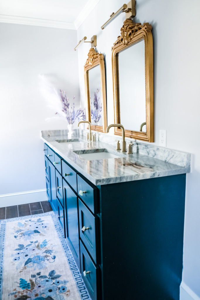
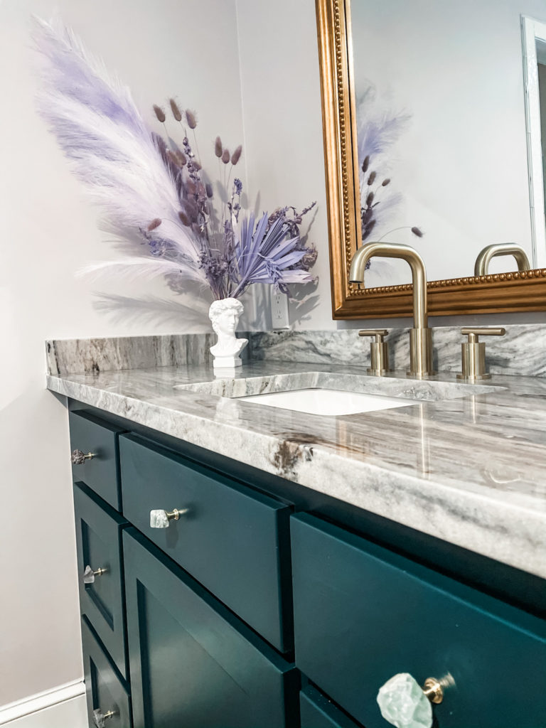
The bathroom really came together in a pleasing way. The paint color, Violet Pearl, is an icy, frosted shade of pale lavender that feels peaceful, spa-like. The shower tile has a pearlescent quality that reminds me of the interior of a shell. And the little cabinet pulls were an especially fun find: they’re actually each a fluorite crystal. Pale, seafoam green, lavender, gray, and crystal colors ended up being so complementary with the shades in the kitchen tile. A pair of ornate, brass mirrors added a feminine finish. The cabinets are once again painted Dark Harbor, and I was happy to see how nicely the deep jewel tone plays with pale, ethereal colors like lavender and mint.
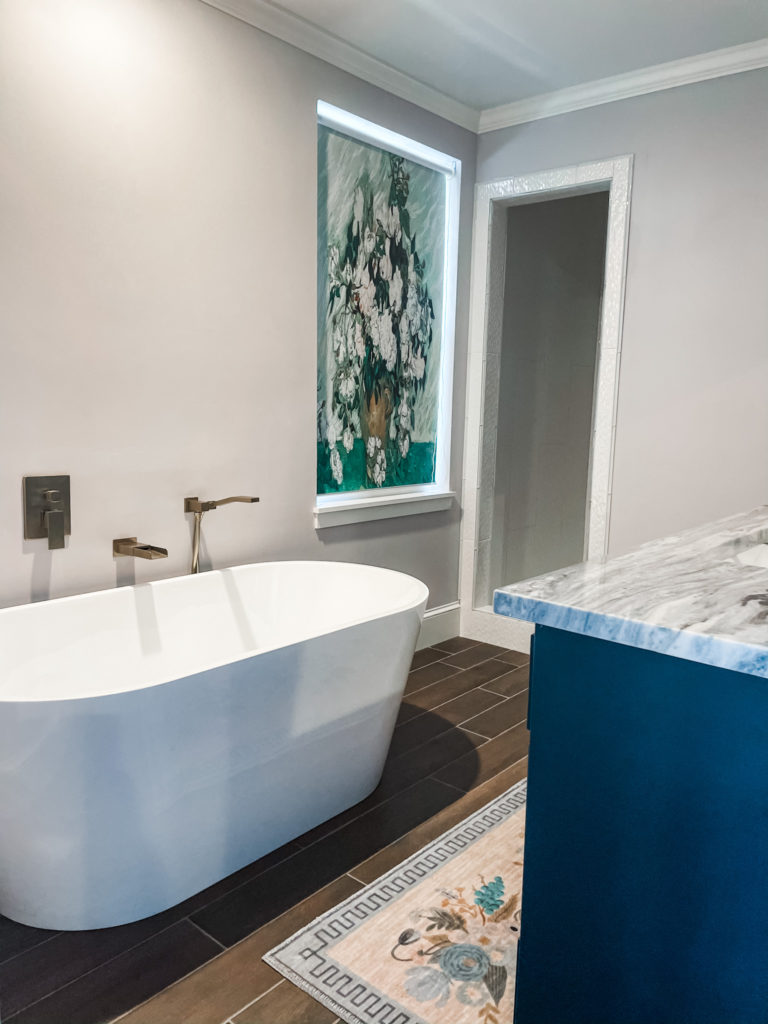
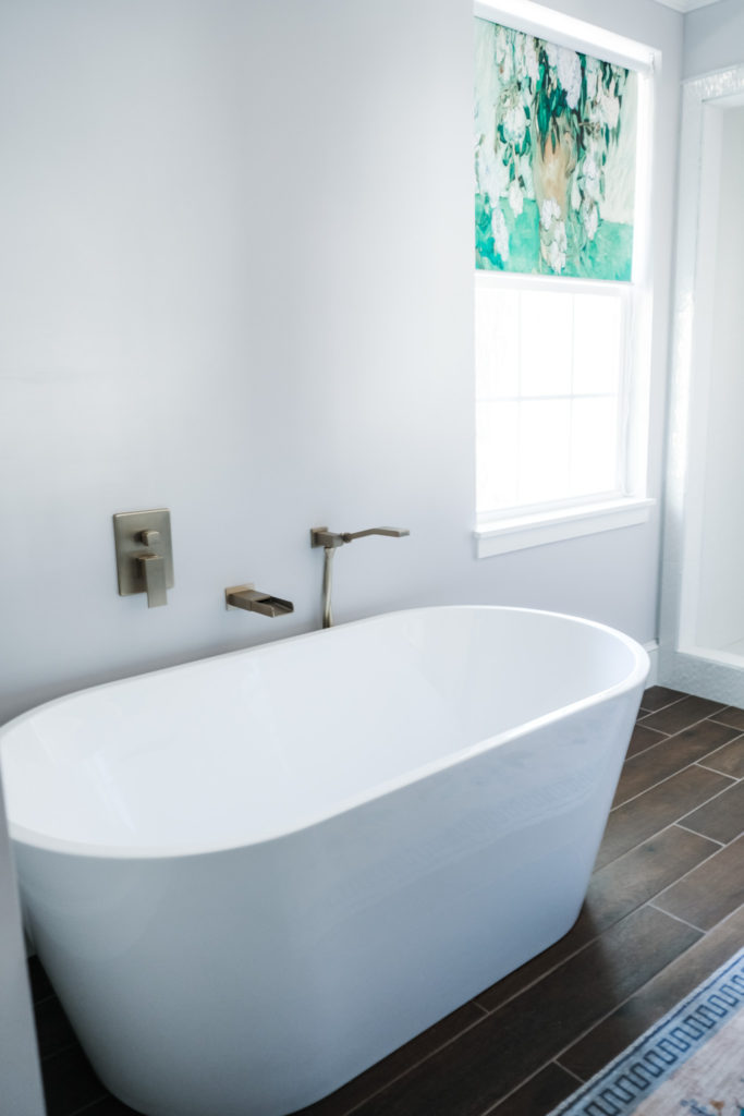
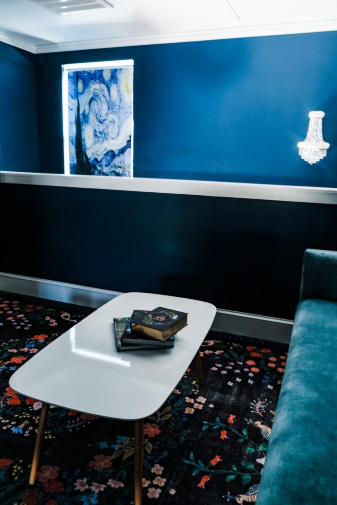
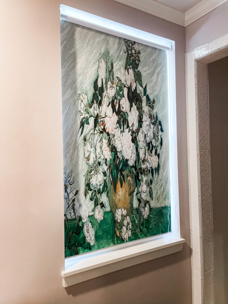
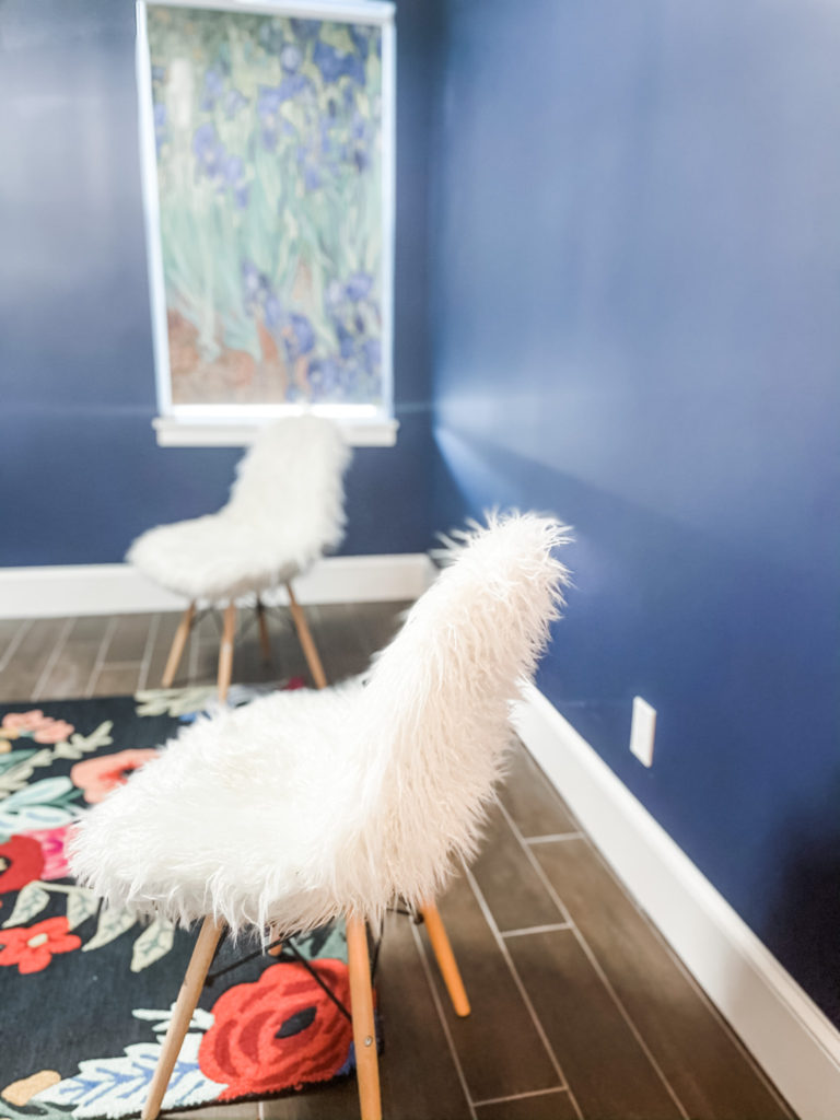
All throughout the space are hung some of my favorite flourishes– the blackout window shades! Each is a Van Gogh painting: Still Life: Vase with Pink Roses, Wheat Field with Cypresses, Irises, and of course, The Starry Night. I was slightly afraid that together, they might look kitschy, like I’d gone to Amsterdam and bought prints at the tourism center. Like they would be really on the nose, you know? Thankfully, that didn’t happen at all. The shades just work so well in the space, and have the added benefit of looking like art hanging on the walls. Again, only something that would ever work in a small space.
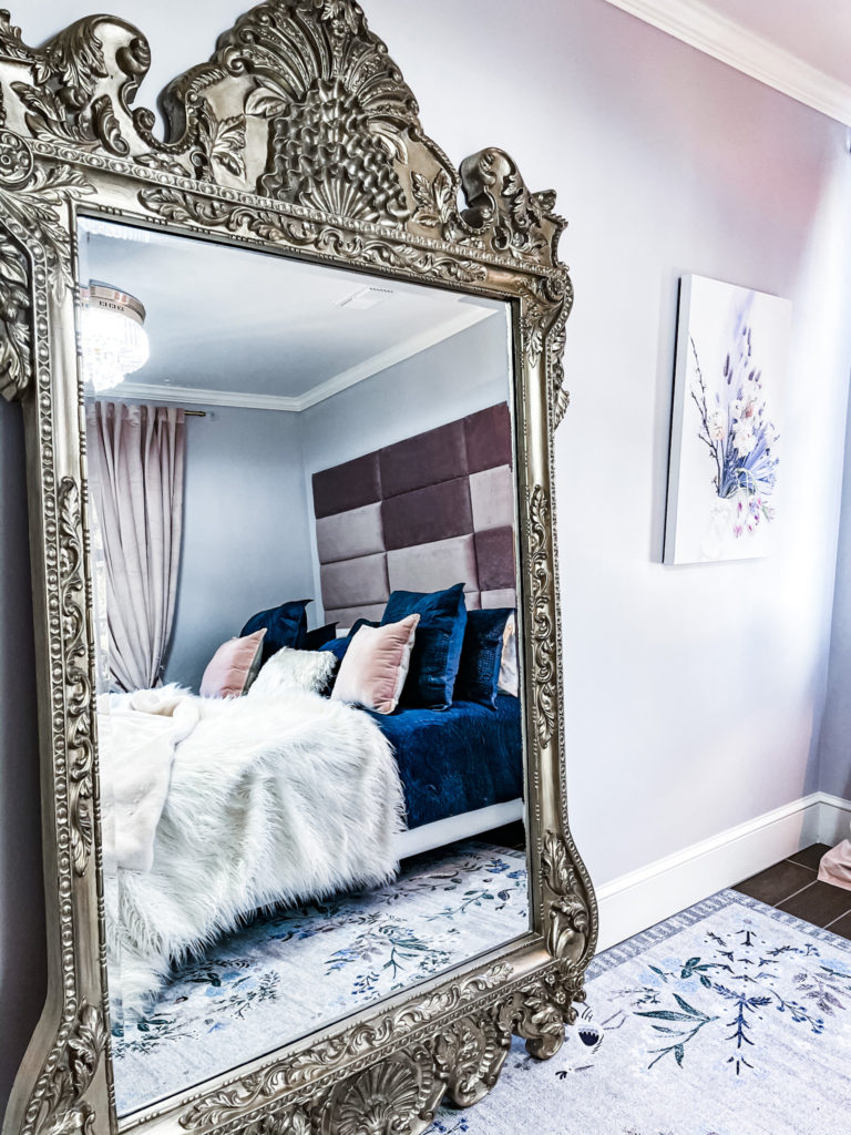
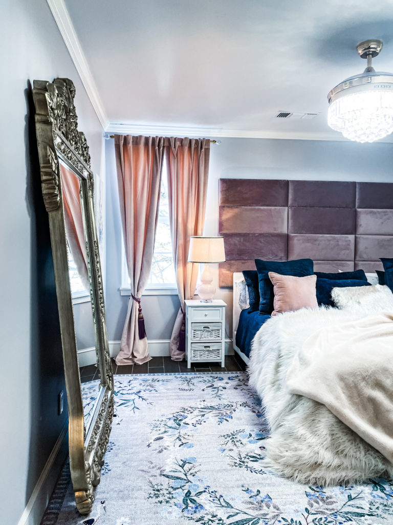
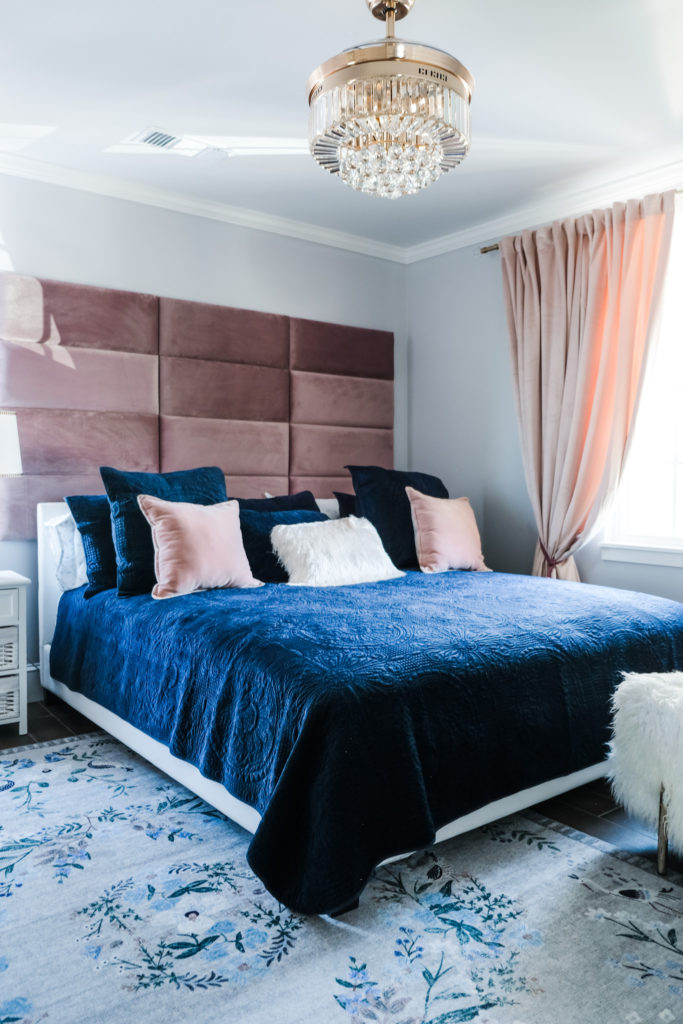
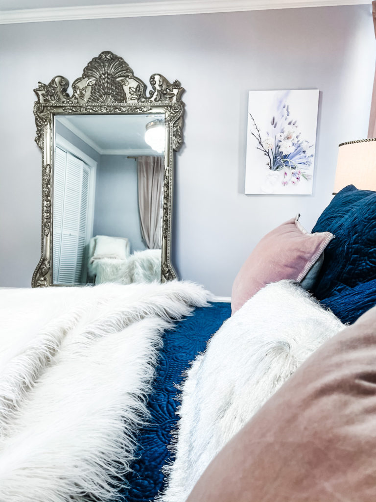
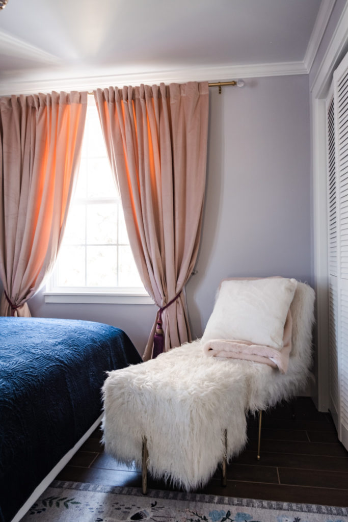
My bedroom is an icy, velvety, floral-filled refuge. Violet Pearl made this room feel heavenly. Meanwhile, the Midnight velvet bedding added something luxe, a depth that I wouldn’t have achieved with white or ivory. It was important that that color be Midnight—not navy (which, for whatever reason, is just not my thing) or any mid-tone blue. The color needed to play well with the deep teals and be almost black in its depth and intensity. And it is! I actually had intended the mauve velvet headboard for another space, but it worked so well here, it had to be installed. After much trial and error, I settled on a ballet pink curtain with plum tie-backs—colors that envelop and embrace the other hues in the room (lavender, blue, stone gray). The rug, like that in the living room, features the sweetest, most delicate flora and fauna– only this time in white, gray, mauve, blush, deep blues, and lavender. And as for the ornate gold mirror—well, naturally.
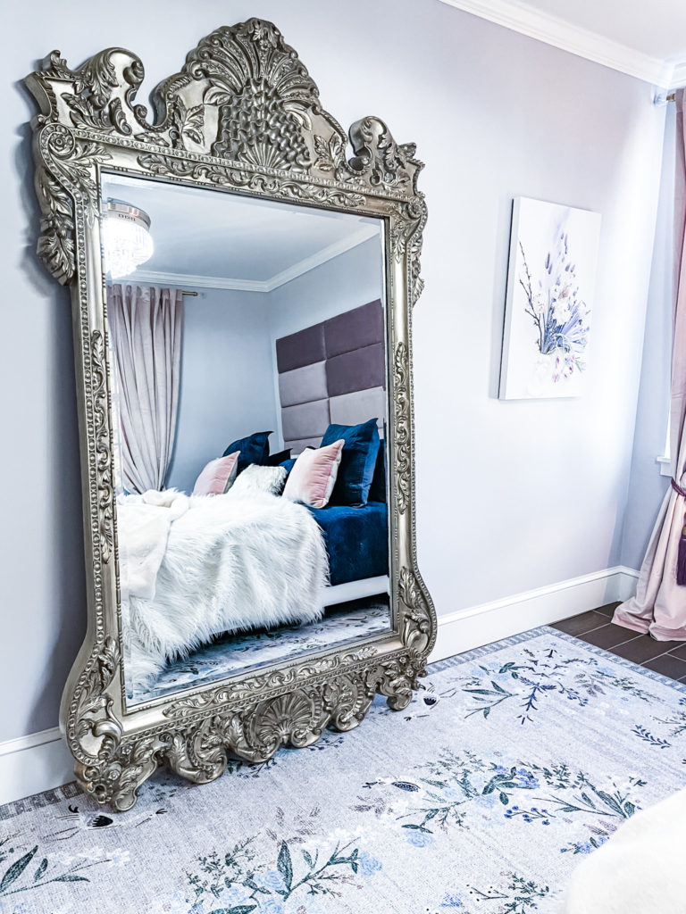
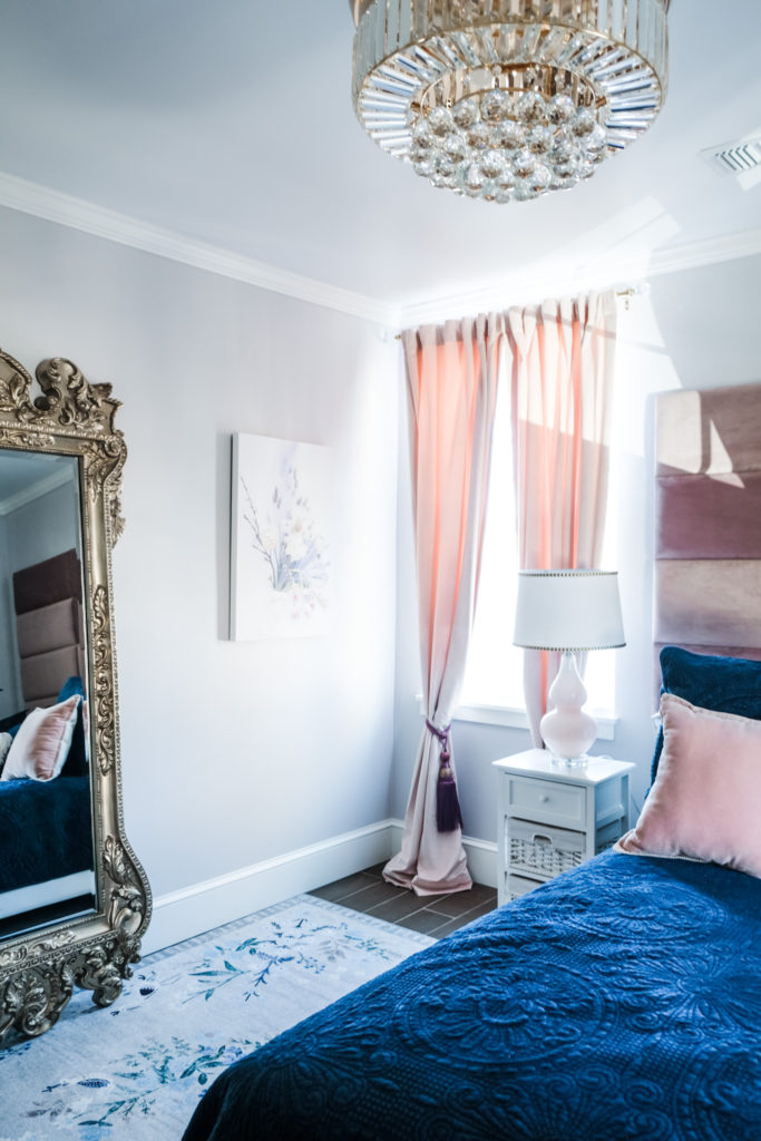
I am besotted with this frosty, feminine mix of colors and plush textures. I’m also attached to the canvas of an arrangement I created and photographed in the snow this past wintery Valentine’s Day.
It is the perfect little refuge for me.
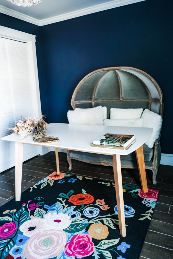
Then there is the study, a space wherein I wanted to be able to think well and deeply, a space that would reflect the beauty and intensity of creative work. The paint color is a subtle variation on the teals that predominate the palette; called Stunning, it is a deep blue with the slightest suggestion of purple. It’s ravishing, really. The gray velvet lounge works as nontraditional desk seating, and the rug, again by Rifle Paper Co., is resplendent with color and flora. Van Gogh’s Irises are also nice to keep me company. Oh, and also Izzie, captured here in the most perfect photo of my life: at breakfast, in Vail, with flowers.

As I walk through the space, I am struck by how well the palette works, especially as I peer into one room from the next. I’ll see a hint of lavender or gemstone green, and this will catch the shimmer on the kitchen tile or a crystal pull. It’s these gentle, nearly imperceptible transitions that make the space feel intelligent to me. The palette is so rich and complex, but thanks to my family’s help, it got a really elegant interpretation.
As I’m sitting here writing, I feel very fully myself. Deeply contented in a space that reflects me. It’s an aspirational space, and therefore motivates me to live better. Designing it has reminded me of just what an honor it is to create a home. A sanctuary where one can dwell in grace. I am aware of what a luxury it is to have such a space, and I am honored to nurture, respect, beautify, tend, and care for my own. I am reminded of what a pleasure it is to create at all, and how creativity, if undertaken in a prayerful and surrendered manner, can be an act of goodness. It can be about putting goodness, beauty, and purity back into life. I do not deserve such a pretty space, but I am deeply grateful for it.
I’ve been reflecting on some of my favorite words, and it seems they all have a common theme. Sanctuary, refuge, dwelling, retreat, abiding. All of these embody the concept of being deeply at peace– being fully known and secure– which can only be found dwelling in Christ’s love. I love to think of Him shedding His grace abroad in my heart, dwelling there. And I only ever experience any real rest when I dwell deeply in His grace. For me, the outer creation of a space should somehow, in some unspoken way, evoke this intimacy and security, this ultimate sanctuary. This relationship that changes everything.
As far as the design goes, Botanical bohemian may just be my favorite mood of all, the pattern I would use to describe my very life. At any rate, it is a joy to interpret in and through an interior space.
May we all work with the space we have, and keep it swept and clear (to paraphrase a favorite quote), so as to leave room enough for grace. <3
“The eternal God is your refuge, And underneath are the everlasting arms” (Deuteronomy 33:27).